Batman Font
I think Batman font is such a bold and dramatic typeface that instantly reminds me of Christopher Nolan’s legendary Batman trilogy. I love how it’s known for its gritty tone and striking visuals – the film’s logo design really made The Dark Knight font a standout in superhero cinema for me. What I find amazing is how those sharp, blocky letters paired with the iconic bat symbol perfectly capture that dark, intense atmosphere of Gotham City that I’ve always been fascinated by.
The Dark Knight Font
Download The Dark Knight Font (Gotham Knights) here:
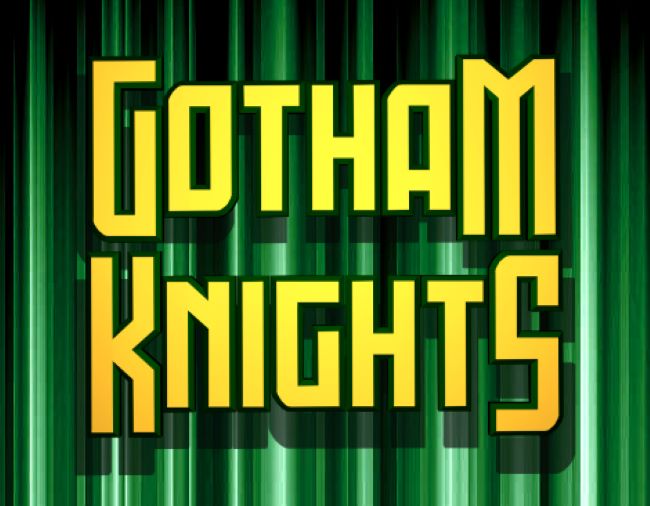
Gotham Knights Font
I believe The Dark Knight (2008) wasn’t just another superhero movie—it completely redefined the genre with its deep storytelling, unforgettable characters, and haunting visuals that still give me chills. Just like the film, I feel The Dark Knight font embodies strength, mystery, and power in ways that really speak to me. I’ve noticed that designers and fans like myself often look for this font when we want to recreate posters, fan art, and projects inspired by Batman’s darker world.
Although I should mention there isn’t an official font released by DC or Warner Bros., I’ve found several fan-made fonts that closely replicate the movie’s style. The most popular one I’ve come across is Gotham Knights Font, which I think mirrors that heavy, cinematic look we see in the promotional materials. Another favorite of mine is Dark Knight Rises Font, designed to reflect the bold typography used in the later films of the trilogy.
I really think the lasting popularity of The Dark Knight font shows how much influence typography can have in shaping the identity of a movie. Just as Batman became a symbol of justice and resilience, I believe this font continues to inspire designers like me who want to bring a sense of boldness and cinematic flair to our work.


