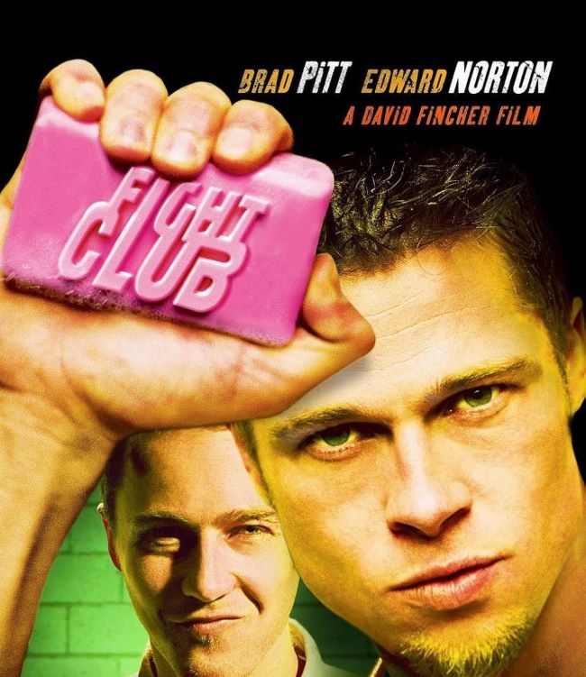
Fight Club Font
Okay, let’s talk about the Fight Club font. First rule? It’s one of the most aggressively cool typefaces to ever hit the screen. David Fincher’s 1999 masterpiece wasn’t just a movie; it was a raw, visceral punch to the gut of consumer culture—and the font captures that chaotic, anarchic spirit perfectly. You know the one. It’s the same battered lettering famously slapped onto that pink bar of soap. It’s more than a font; it’s a symbol.
Download Fight Club Font (Fight This) here: Fight This Font
This thing is heavy, distressed, and looks like it’s been through a back-alley brawl. It’s the perfect visual representation of the film’s gritty themes—shattering identity, raging against consumerism, and pure anarchy. It’s no wonder designers and fans hunt this thing down for posters, fan art, or any project that needs a serious dose of underground, anti-establishment vibe.
Now, the studio never officially released a font—that would be too corporate, right? But the fans delivered. The most popular version out there is easily the Fight This Font, which nails that rugged, blocky look from the logo. Another solid choice is the Fight Club Font by Apostrophic Labs. Both get the job done.
The fact that this font is still so in demand proves a point: powerful typography is a weapon. It defines a legacy. Like the film itself, this font is bold, raw, and completely unforgettable. It’s the go-to choice when you want your designs to not just be seen, but to make a statement. Now, let’s see what you can destroy with it.


