GoodFellas Font
You ever see a font and just know it’s got connections? The Goodfellas font is like that. It’s pure Martin Scorsese—sophisticated but with an edge, reflecting that world of mobsters, power, and sharp suits. The sleek serif style is instantly recognizable; it feels classic but dangerous, just like the movie.
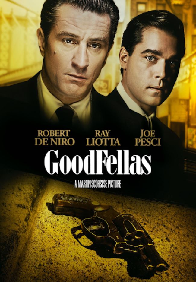
This isn’t just any gangster film. With Ray Liotta, Robert De Niro, and Joe Pesci bringing the heat, Goodfellas set the bar. And that opening title? Simple. Powerful. It perfectly sets the tone for what’s coming: raw, unfiltered storytelling. The typography walks that same fine line—elegant but gritty, making it a go-to for fan art, posters, or any project that needs a dose of mob-inspired style.
Download Goodfellas Font (Boden Esperanto) here: Boden Esperanto
Now, the studio never put out an official font—they’re not exactly the sharing type. But the design is a dead ringer for Boden Esperanto, a typeface known for its clean lines and that timeless cinematic vibe. Over the years, it’s become totally tied to the film’s identity. Want to recreate that classic Goodfellas look? This is your font.
The fact that designers and fans still reach for this font says it all. Great typography doesn’t just complement a film—it helps build its legacy. Just like Goodfellas redefined the gangster genre, this font keeps bringing that same mix of cinematic grit and cool elegance to new creations. Now go ahead—make them an offer they can’t refuse.


