Pulp Fiction Font
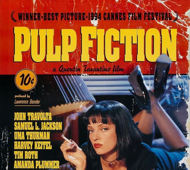
I think the Pulp Fiction font is one of the most recognizable typefaces from any modern movie. Quentin Tarantino’s 1994 classic is just unforgettable—the dialogue, the bold storytelling, the unique style—and that typography is a huge part of it. For me, that bright yellow and red lettering is a total visual symbol of the film’s cool, retro, pulp-magazine vibe.
Download Pulp Fiction Font here: Pulp Fiction Font
The movie itself is a love letter to those classic crime stories and pulp novels, and I feel like the font totally matches that vintage aesthetic. Its bold, blocky style really stands out, which makes it perfect for posters, fan art, or any project that needs a retro cinematic feel. It’s my go-to when I want to give something that same edgy and timeless energy.
From what I’ve seen, there isn’t an official font released by the studio, but the fan-made version everyone uses is called Pulp Fiction M54. I like it because it gets so close to replicating that heavy, condensed lettering from the film’s opening credits.
The fact that this font is still so popular just shows how typography can become a real cultural icon. Just like Tarantino’s film, I think the typeface is bold, unforgettable, and full of attitude. It’s no wonder it remains a favorite for adding a touch of cinematic cool to pretty much anything.


