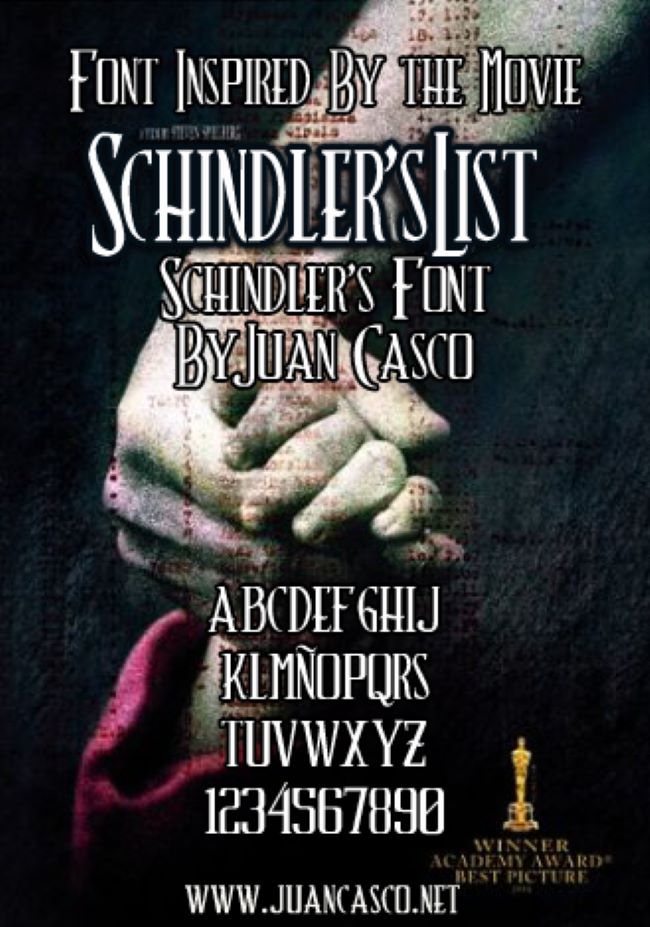
Schindler’s List Font
When I think about the Schindler’s List font, what strikes me most is how it carries the film’s immense weight. Steven Spielberg’s 1993 masterpiece tells a story of profound humanity and tragedy, and its typography is a quiet yet powerful part of that. The elegant, classical lettering doesn’t shout; it speaks with a solemn dignity that mirrors the film’s historical significance and emotional depth.
Download Schindler’s List Font here: Schindler’s List Font
It’s not bold or flashy. Instead, Schindler’s Font by Juan Casco is understated, refined, and traditional. Its serif style conveys a seriousness and timelessness that feels deeply respectful. It’s the perfect match for the film’s stark black-and-white visuals and its heartbreaking narrative. I often see designers seek out this font for projects that require a sense of dignity and authenticity, like creating posters, tributes, or historical commemorations.
There was never an official font released by the studio, which feels appropriate. But a fan-made version called Schindler’s Font has been created to replicate the logo’s elegant serif design. It’s used with care by creators who wish to bring that same sense of gravity and historical remembrance to their work.
The lasting presence of this font shows us that typography can do more than just look good; it can hold emotion and memory. Just as the film left an indelible mark on history, this font serves as a visual symbol of remembrance—a quiet, dignified nod to the past that continues to resonate.


